DESIGN TOPICS POSTER
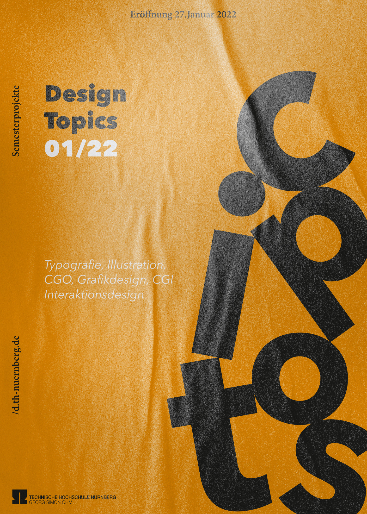
I designed this poster for the Design Topics exhibit at my university. It was only allowed to use type and no illustration. The font I have chosen is the Avenir Next.

I designed this poster for the Design Topics exhibit at my university. It was only allowed to use type and no illustration. The font I have chosen is the Avenir Next.
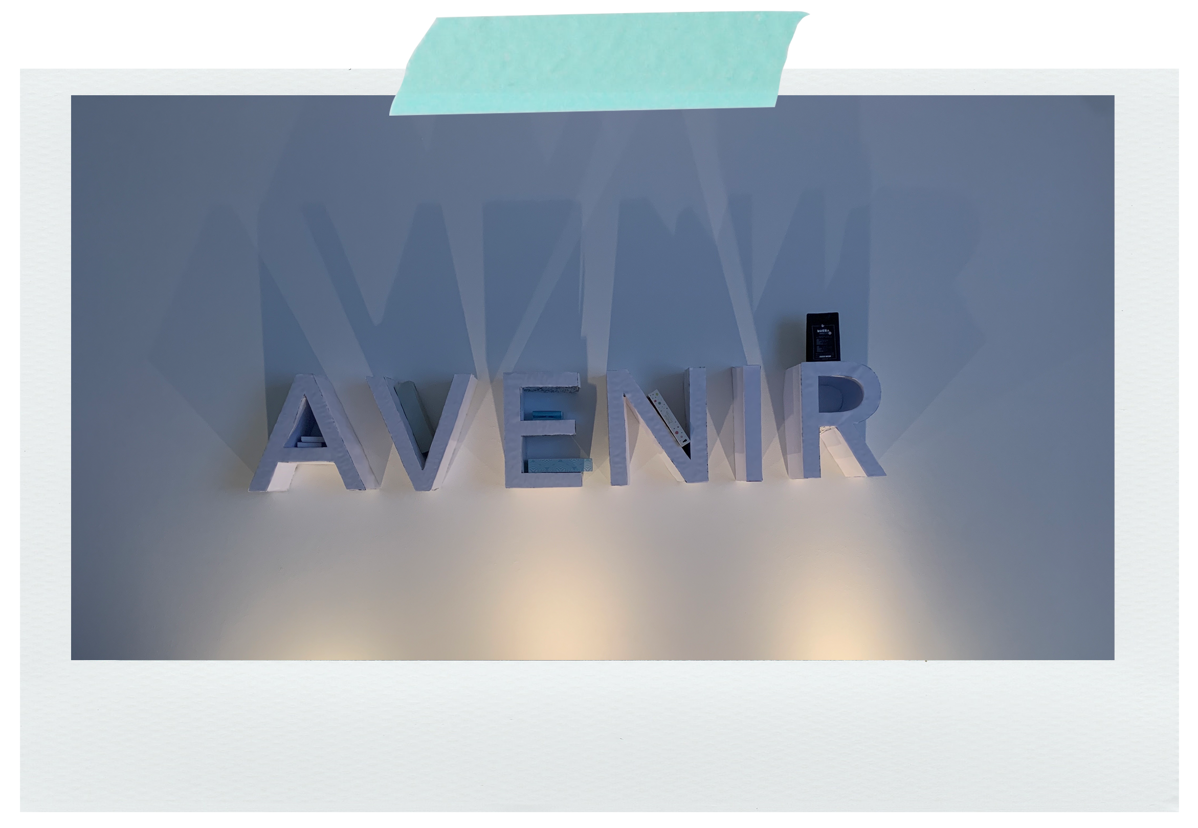
My chosen typeface should now also be represented spatially, working out its character and properties. Since AVENIR is based on geometric shapes and symmetry, I thought about what things are also built on these properties. Furniture came to mind, they are mostly also based on geometry and symmetry, so I created an AVENIR shelf.
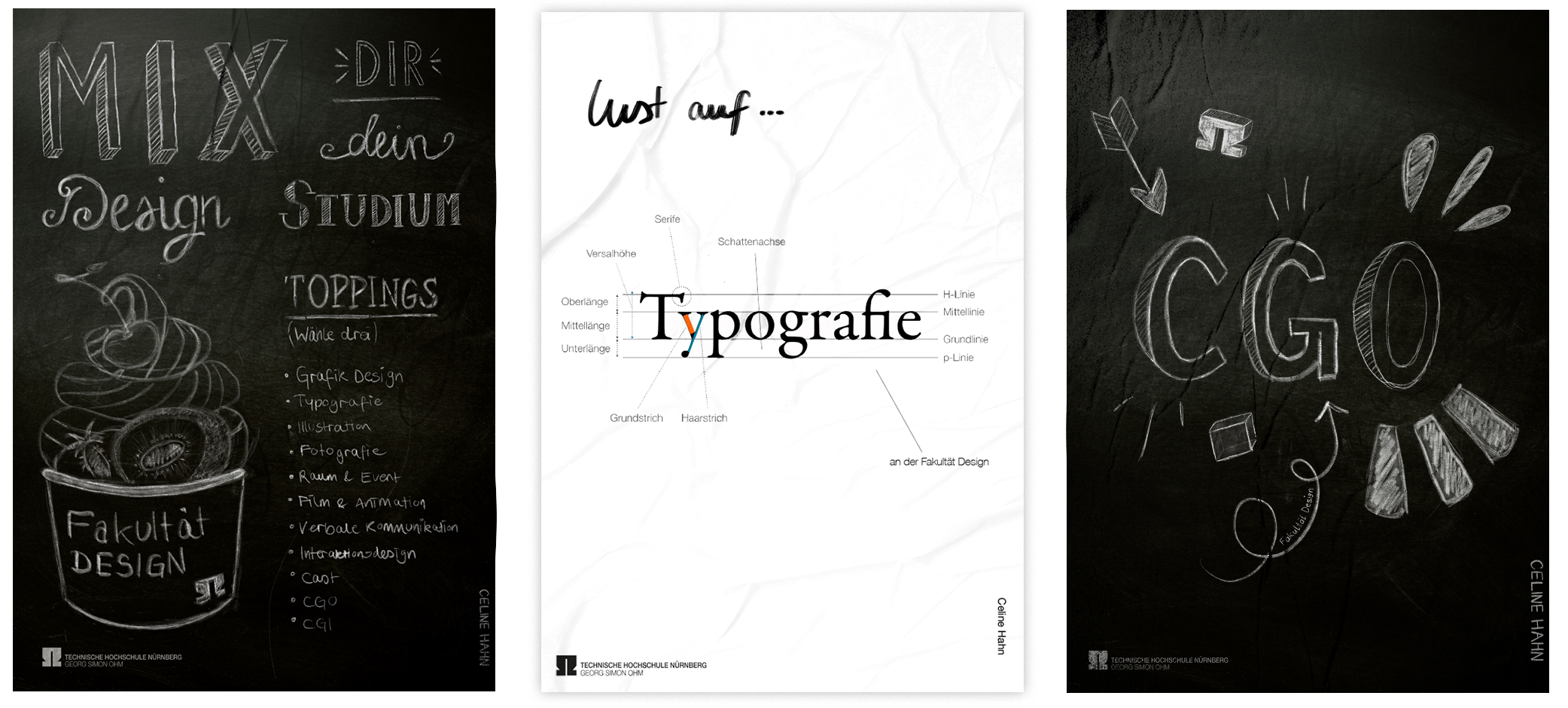
This poster series was created in the first semester of graphic design. The posters are intended to represent the Faculty of Design with the variety of modules that are offered to the students. In addition, a specific module should be represented in the posters.
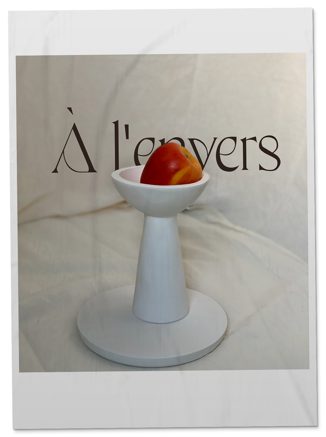
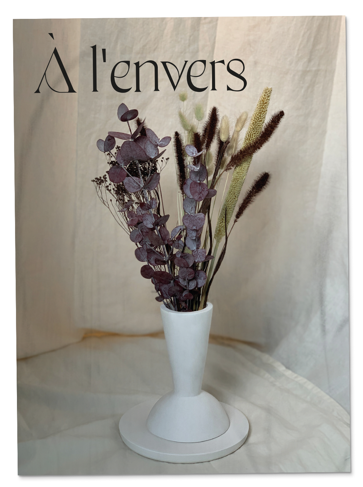
I designed this vessel in the second semester CGO. It can be used as a fruit bowl but upside down also as a vase. This is where the name came from: À l'envers means "overhead".
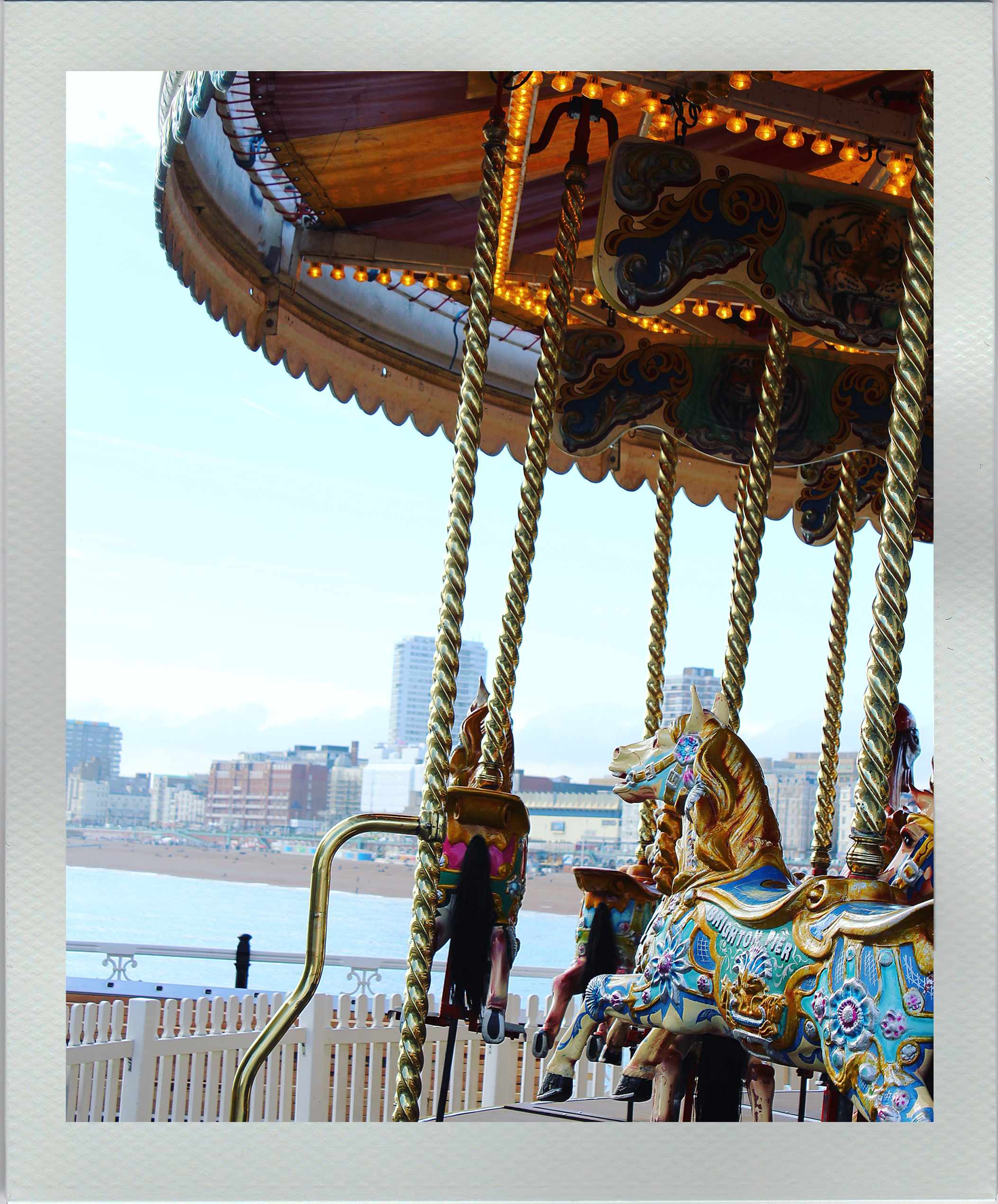
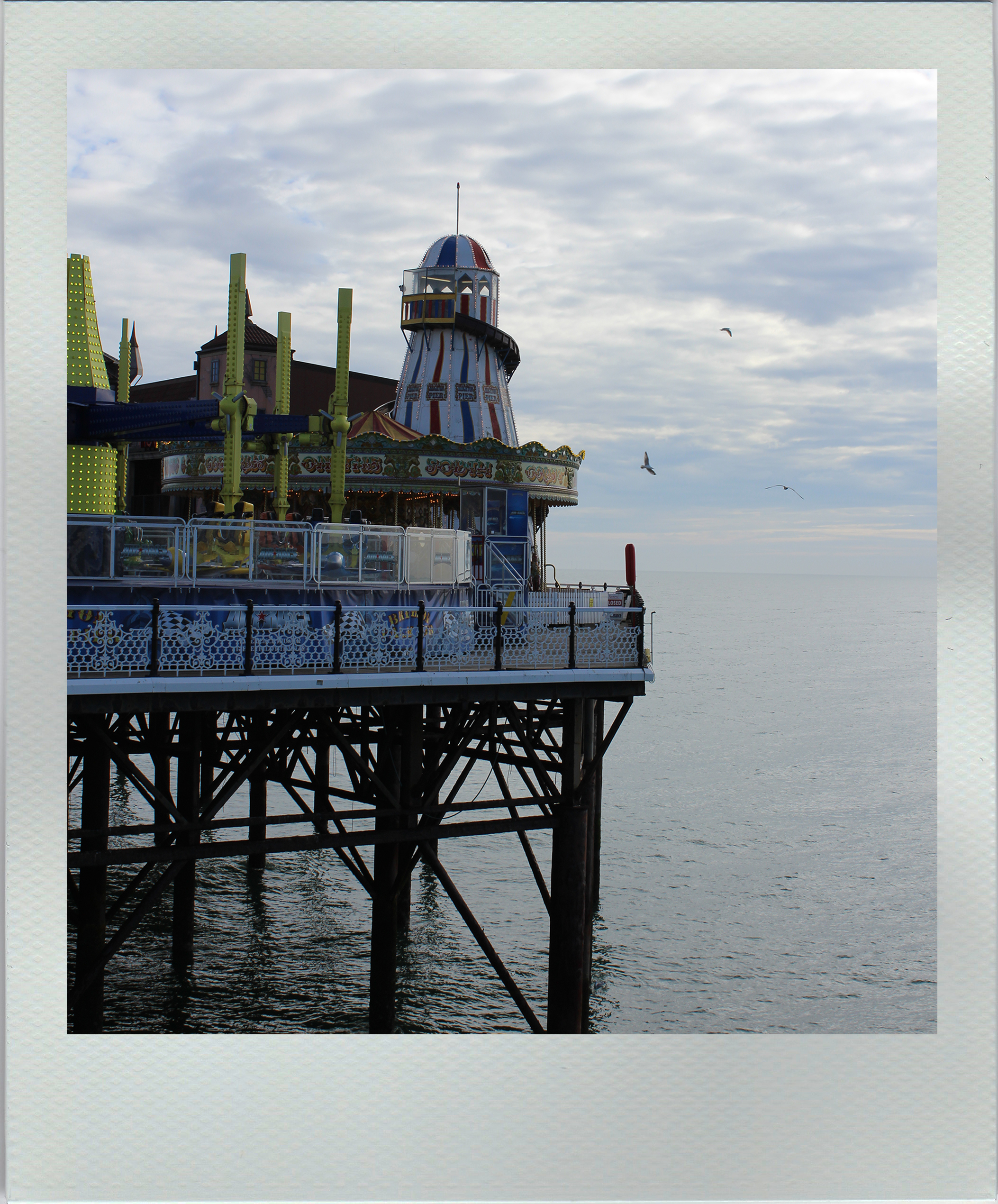
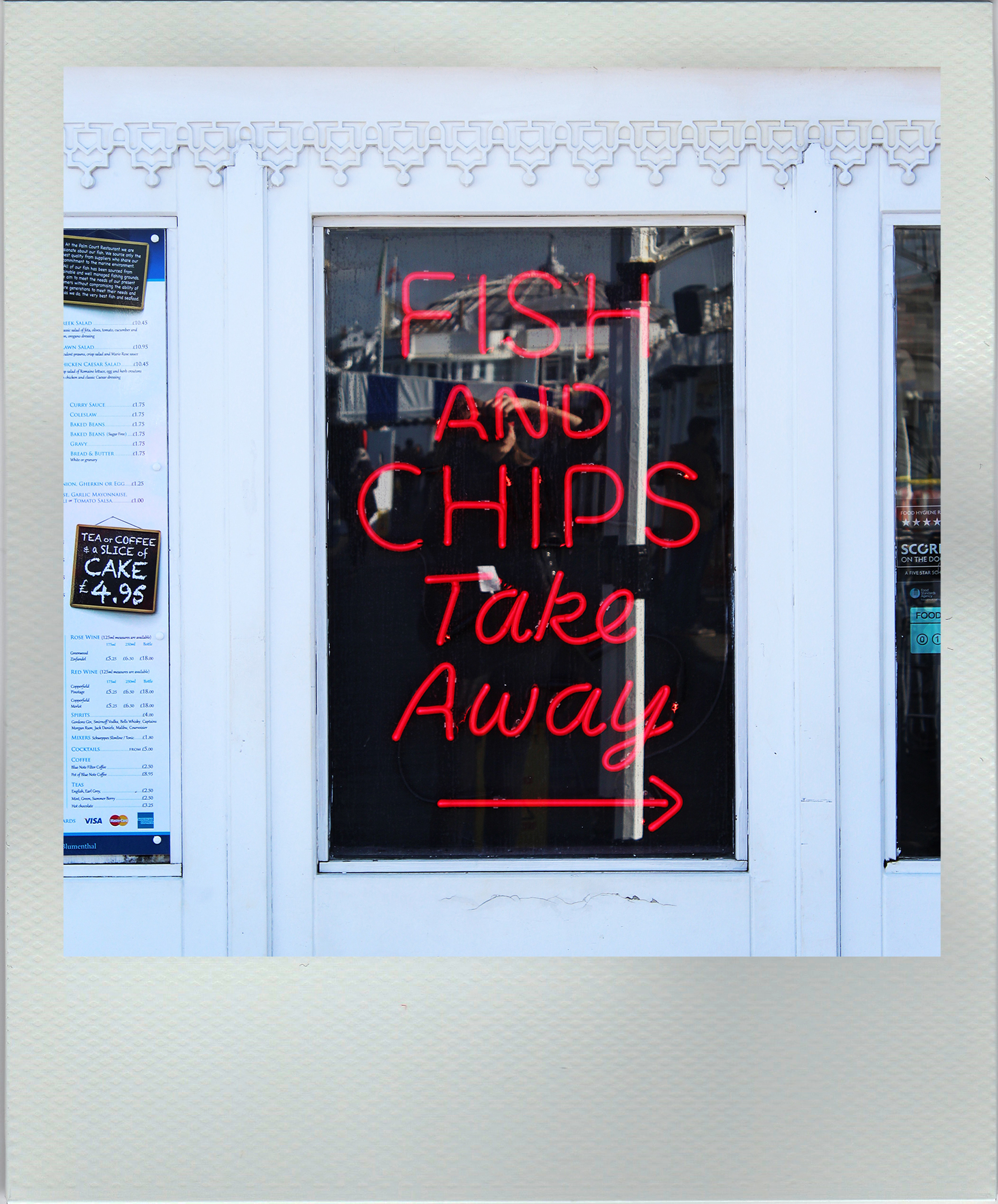
These photos were taken at the pier in my favorite city Brighton.