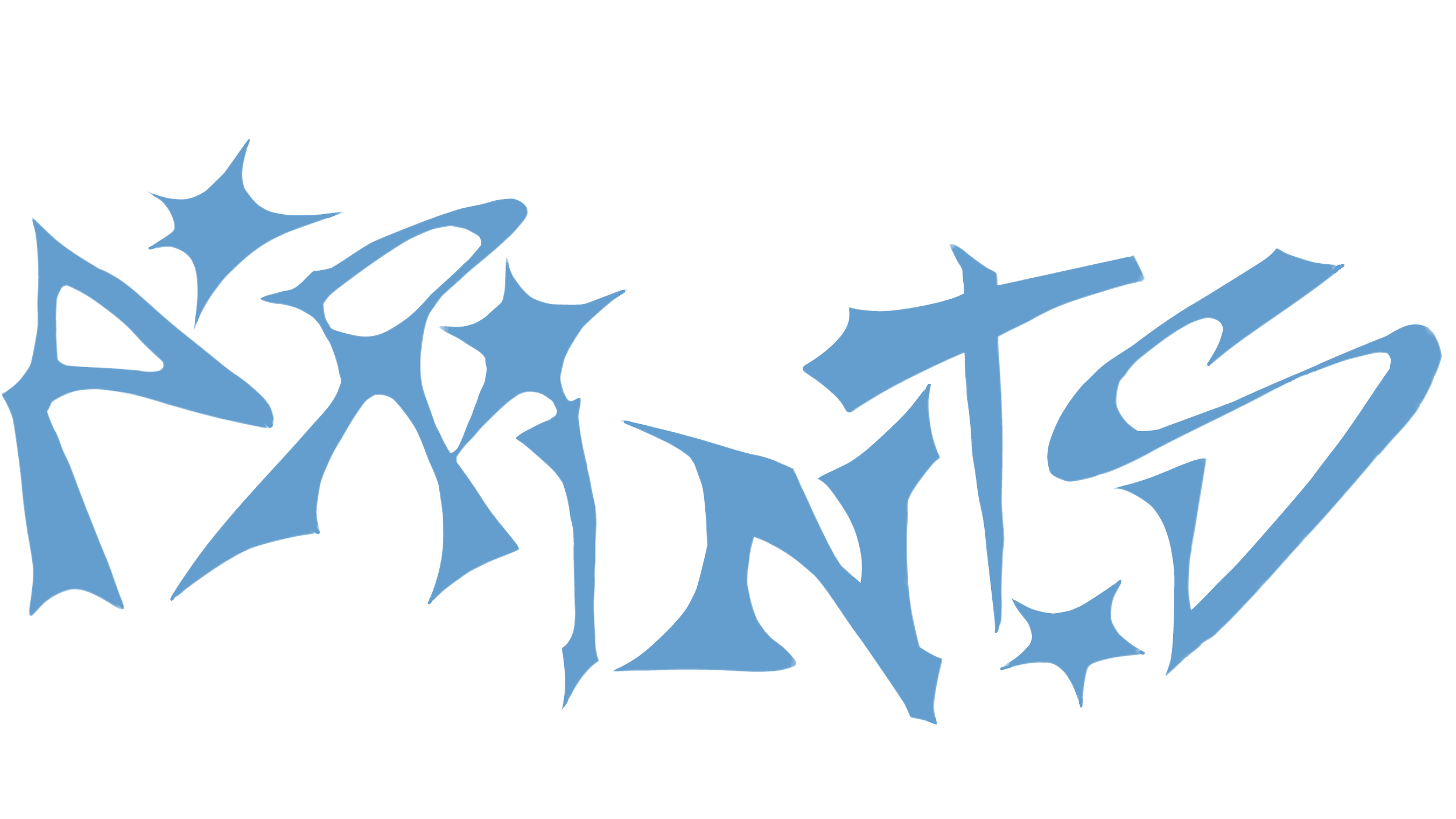
I had to divide a DIN A3 sheet into rectangles and look for interesting details in my font, and then place them positively or negatively in the rectangles and include the name of my font.
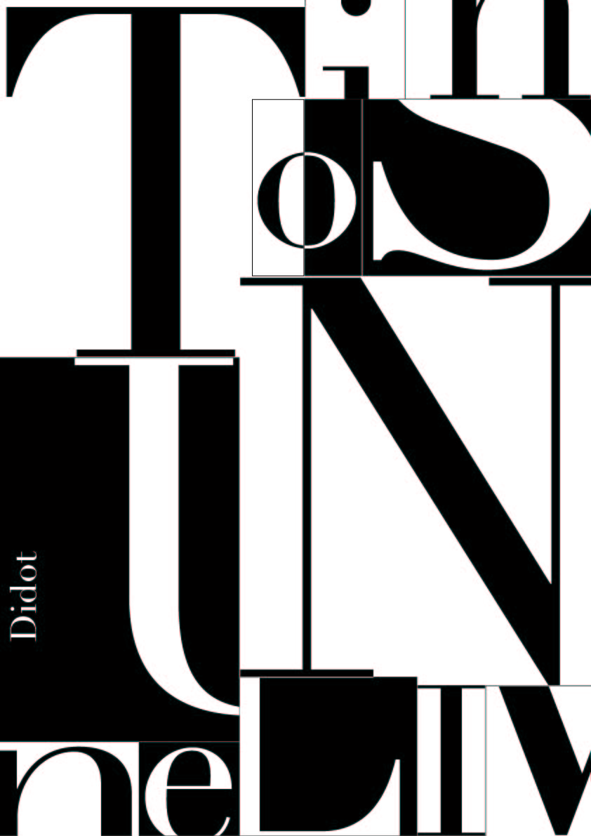
One task from this Semester, with different fonts, contrast pairs, uppercase and lowercase and characters.
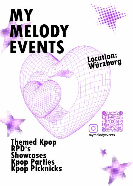
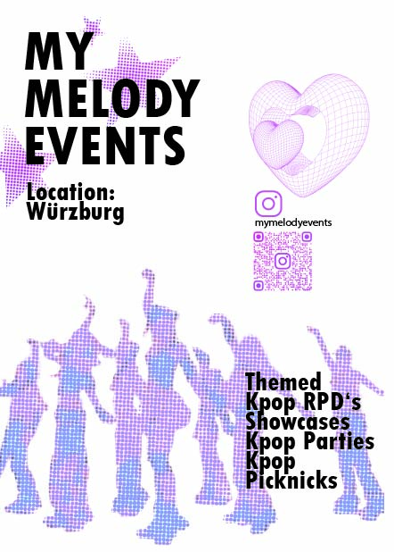
I Designed flyers for my friends, who organzie K-pop Events in Würzburg.
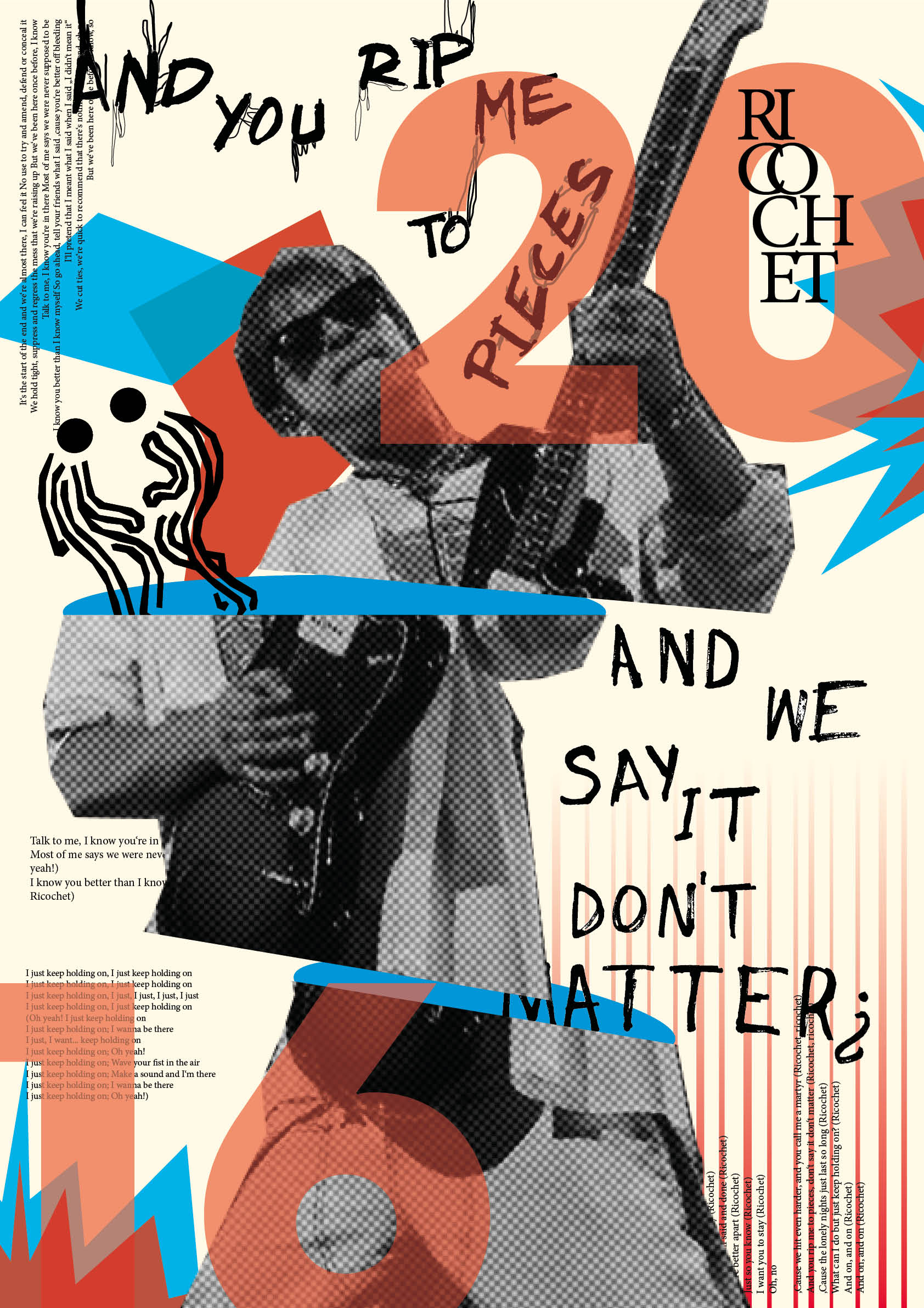
This Poster was a Project for Grafik Design last Semester, designed in the Style of Peter Bankov. It was inspired by the Song Ricochet by Balu Brigada.
Fun Fact: Balu Brigada themselves saw and liked my Poster on Instagram.
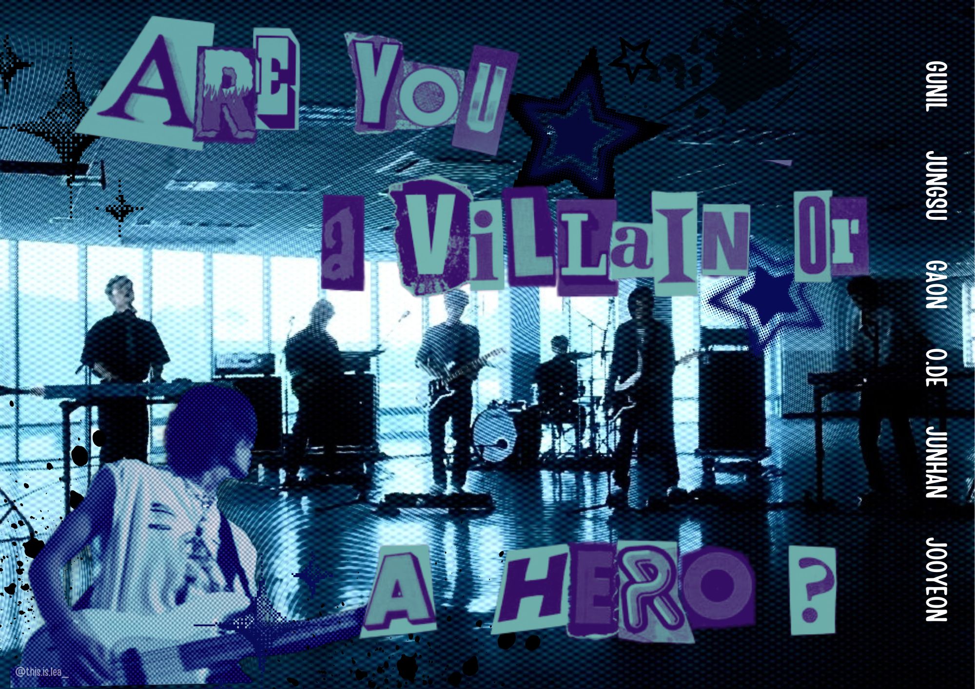
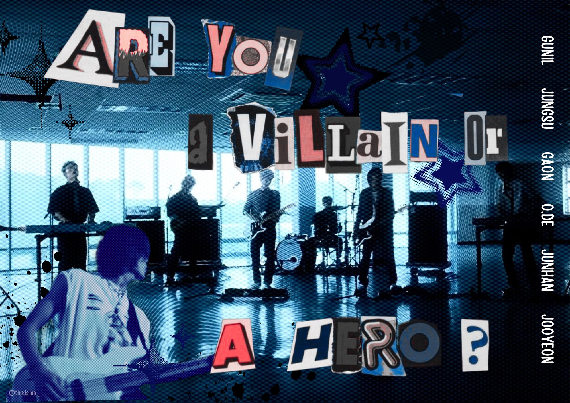
In the Background is a photo the Rock Band "Xdinary Heroes", their names are placed on the side and the Quote in the Middle was from an Interview of the Drummer, regarding the Groups Lore. I made two Versions since I couldn't decide if the letters should blend in with the background or not.
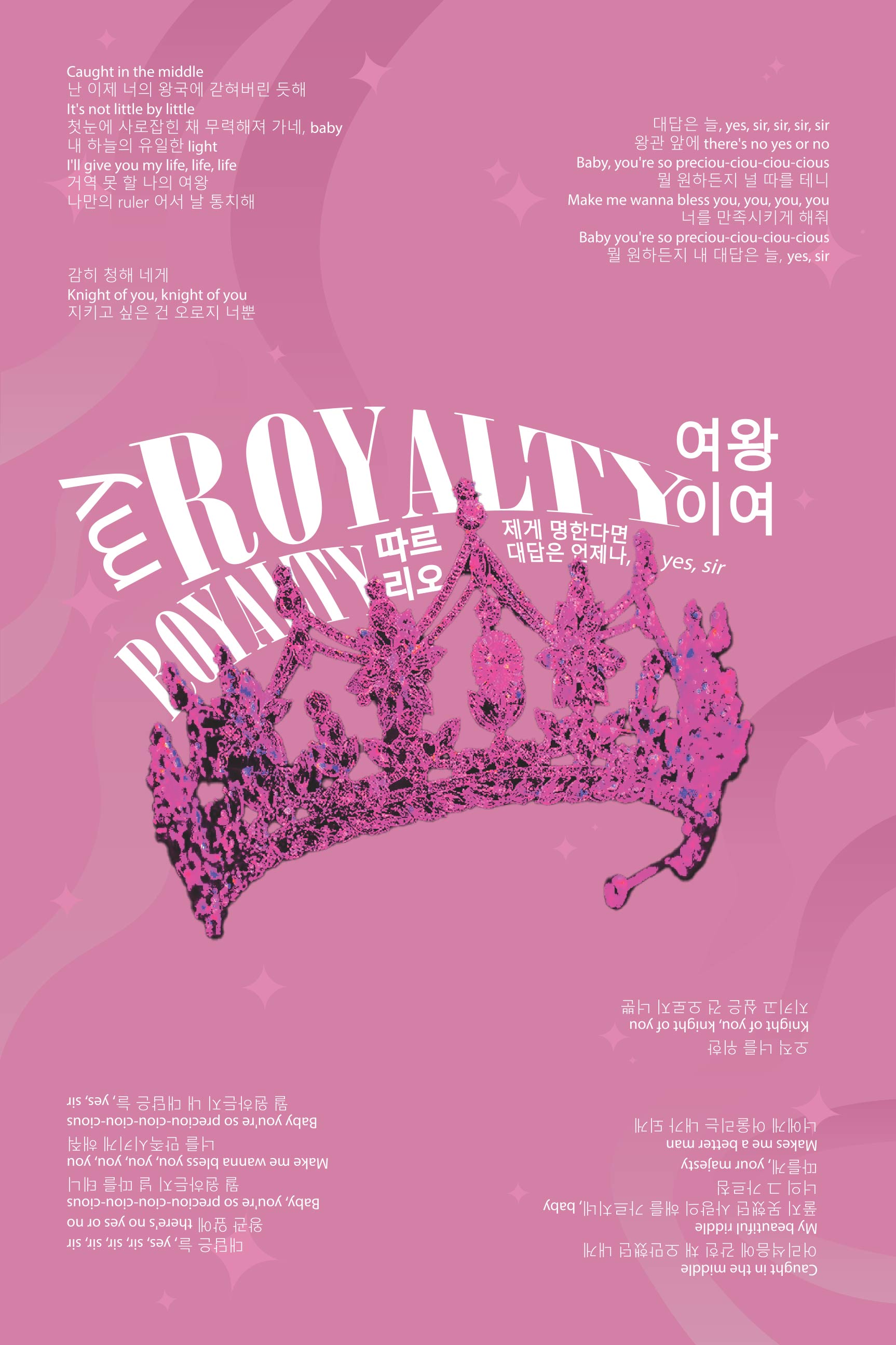
Royalty by Enhypen inspired me to create this lyrics Poster. In a way, it shows how this song makes me feel. It feels glamorous and elegant. Pink was the first color I thought about when listening to it.
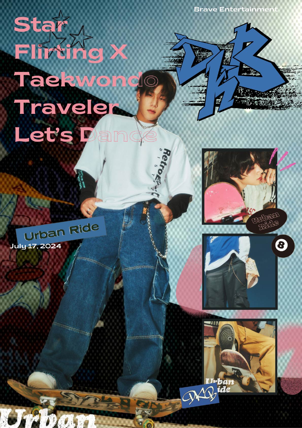
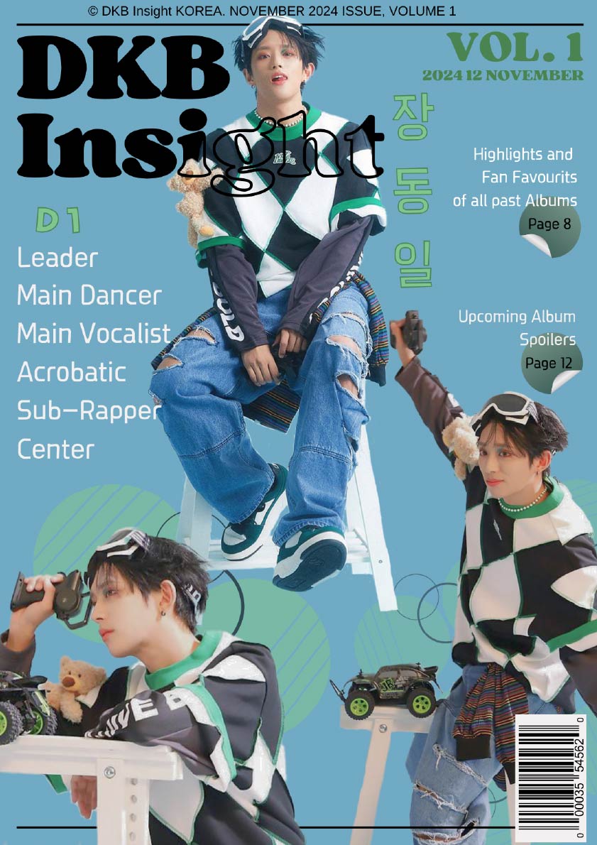
This Poster is Inspired by DKB's second-to-last album "Urban Ride" . The Poster is inspired by the aesthetic of their Album. I used Pictures of their official photoshoot and cropped some of them.
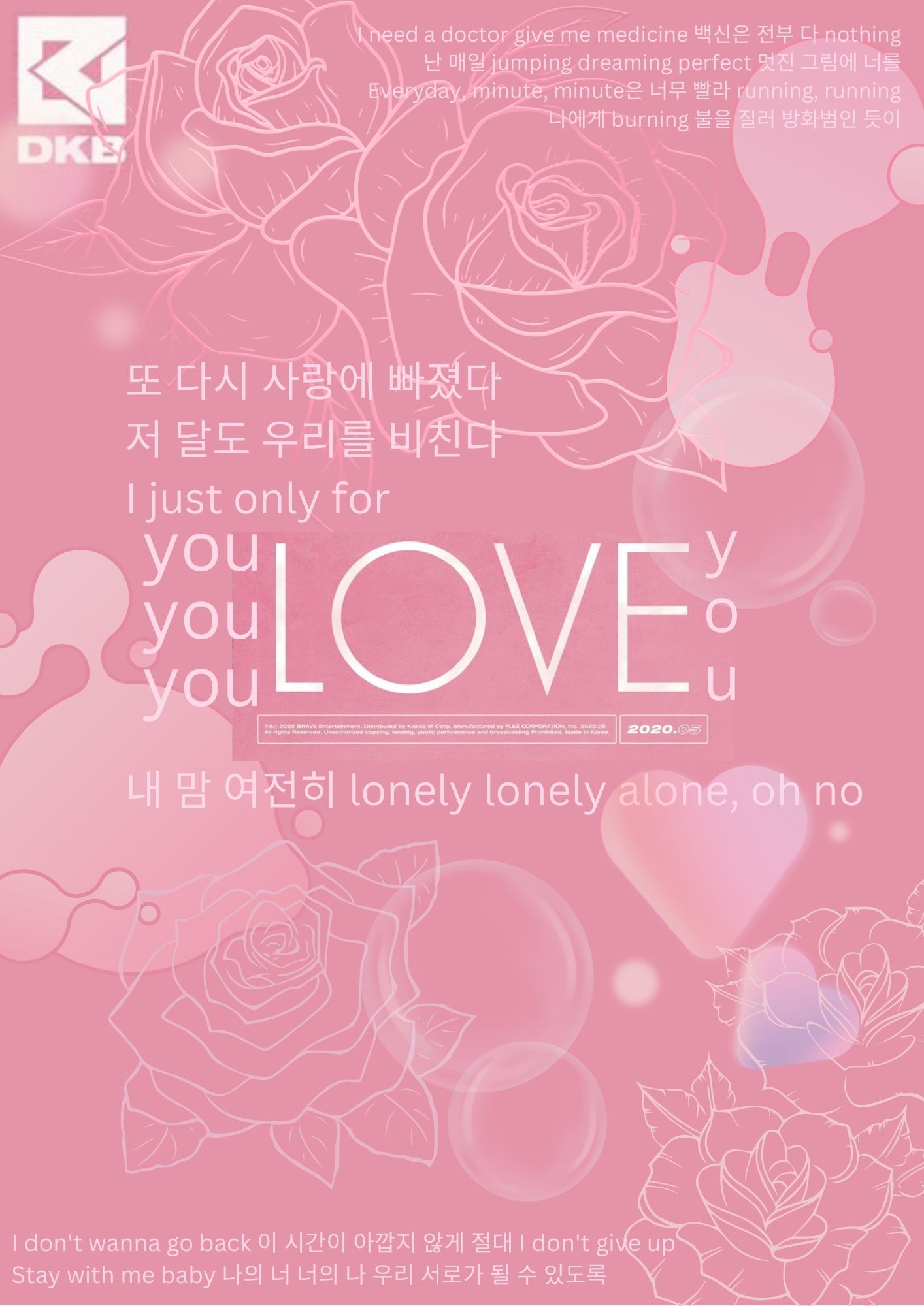
I was listening to 'curious' by DKB on repeat and just had to make it into a lyrics Poster. The beat and vocals of the Song are unmatched, and this is a visual representation of how the song makes me feel.
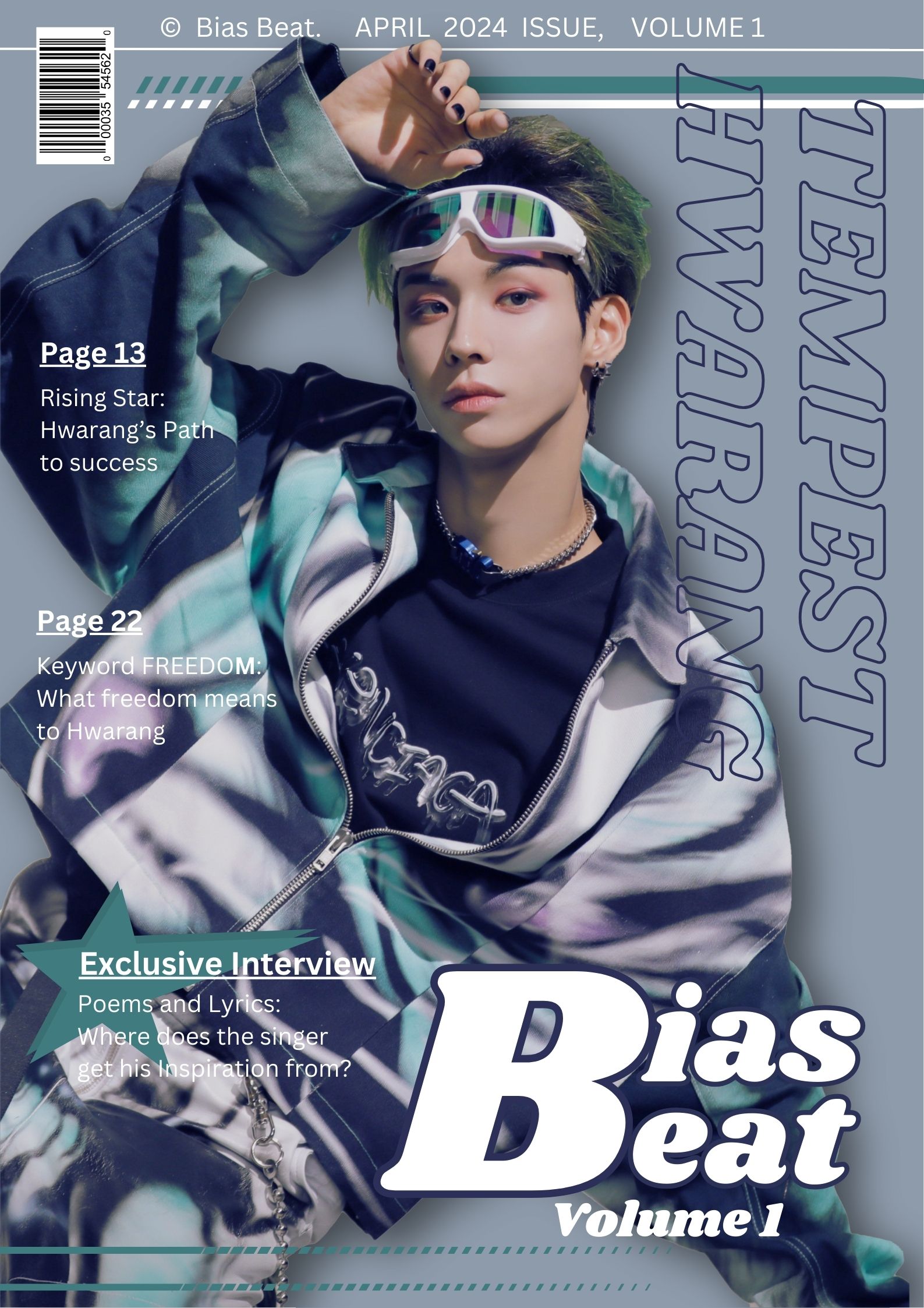
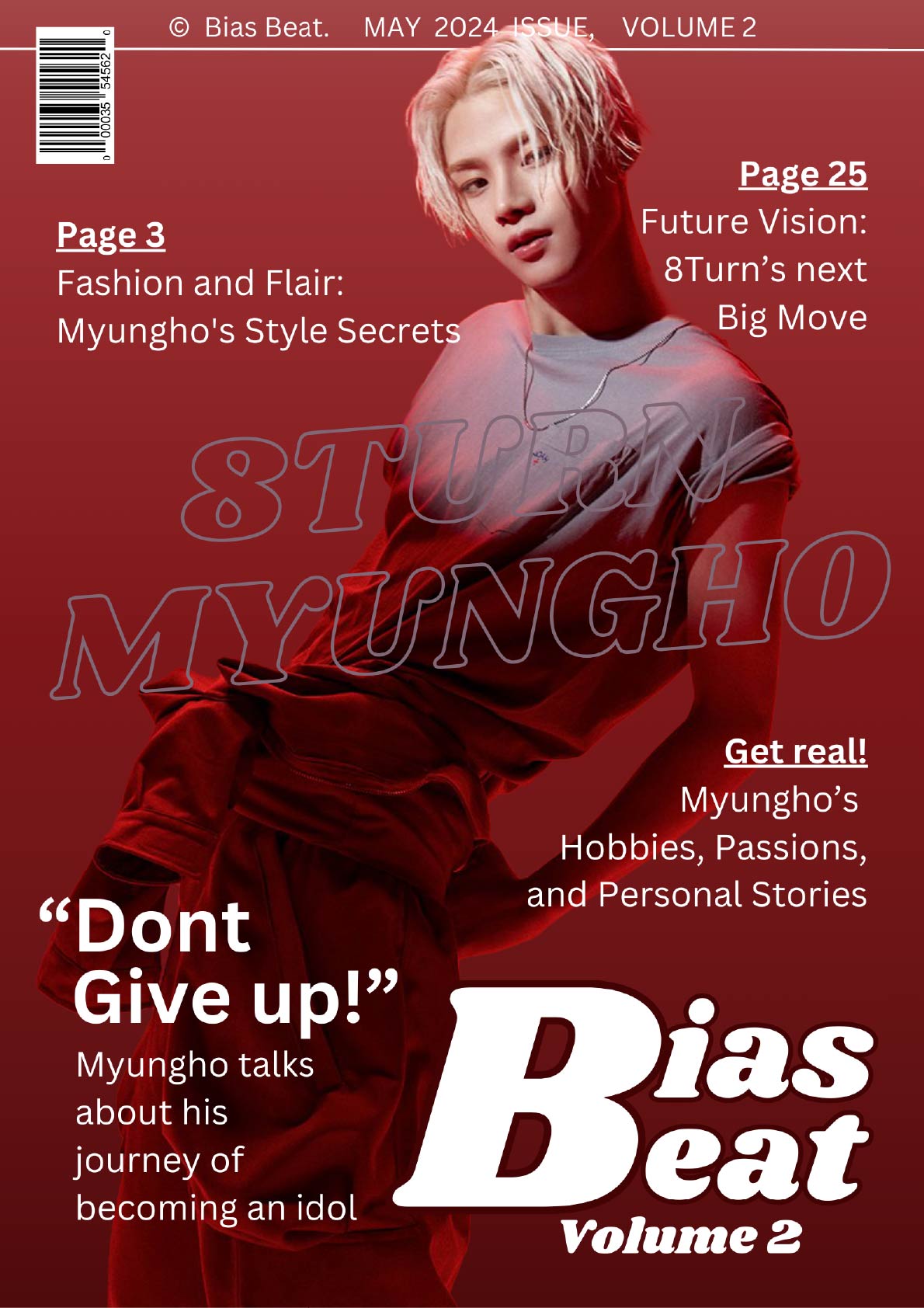
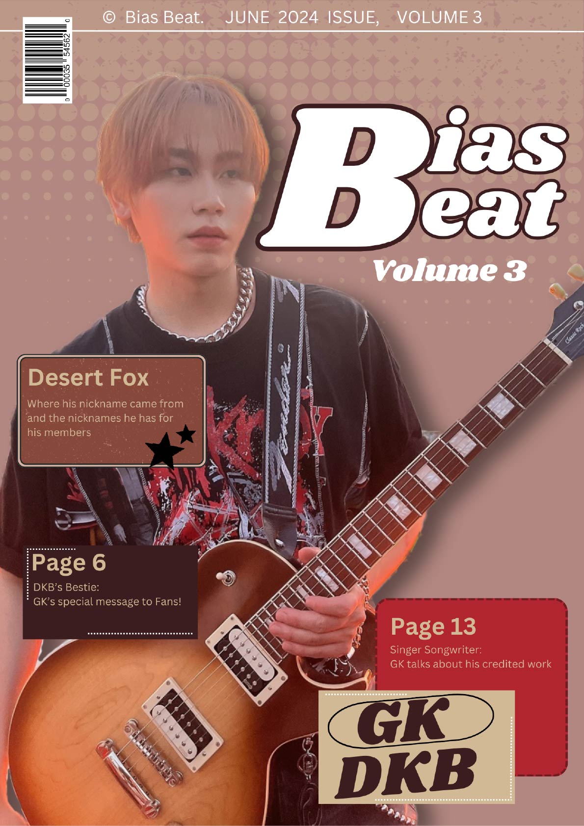
The Title 'Bias Beat' is a combination of the word 'Bias', which means favourite person in a Group/Band, and 'Beat', which stands for their music careers. I wanted to show off my Biases and Design each Cover in a way that matched each person and shows off their vibe.
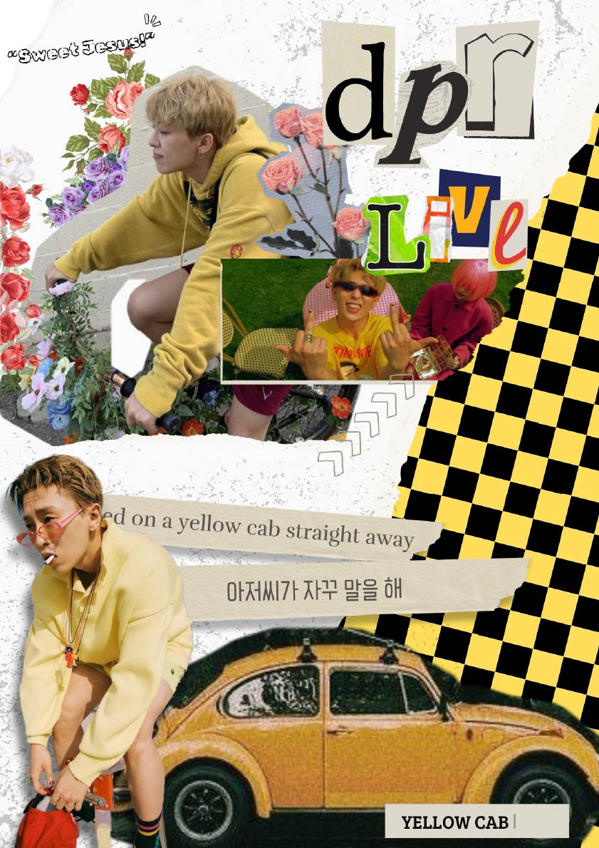
This Poster is Inspired by DPR LIVE's Song "Yellow Cab" . I used part of his album cover as background and Designed it matching the vibe of the Song = Sunny, bright and alive.
The Photos I used for this, are from a Photoshoot from 'bnt Korea', I liked the colorful outfit and the poses. It's playful and light, and that's what I wanted to show with the Cover itself, using light colors and circles in the background, that don't draw the attention away, but give a sense of completion.
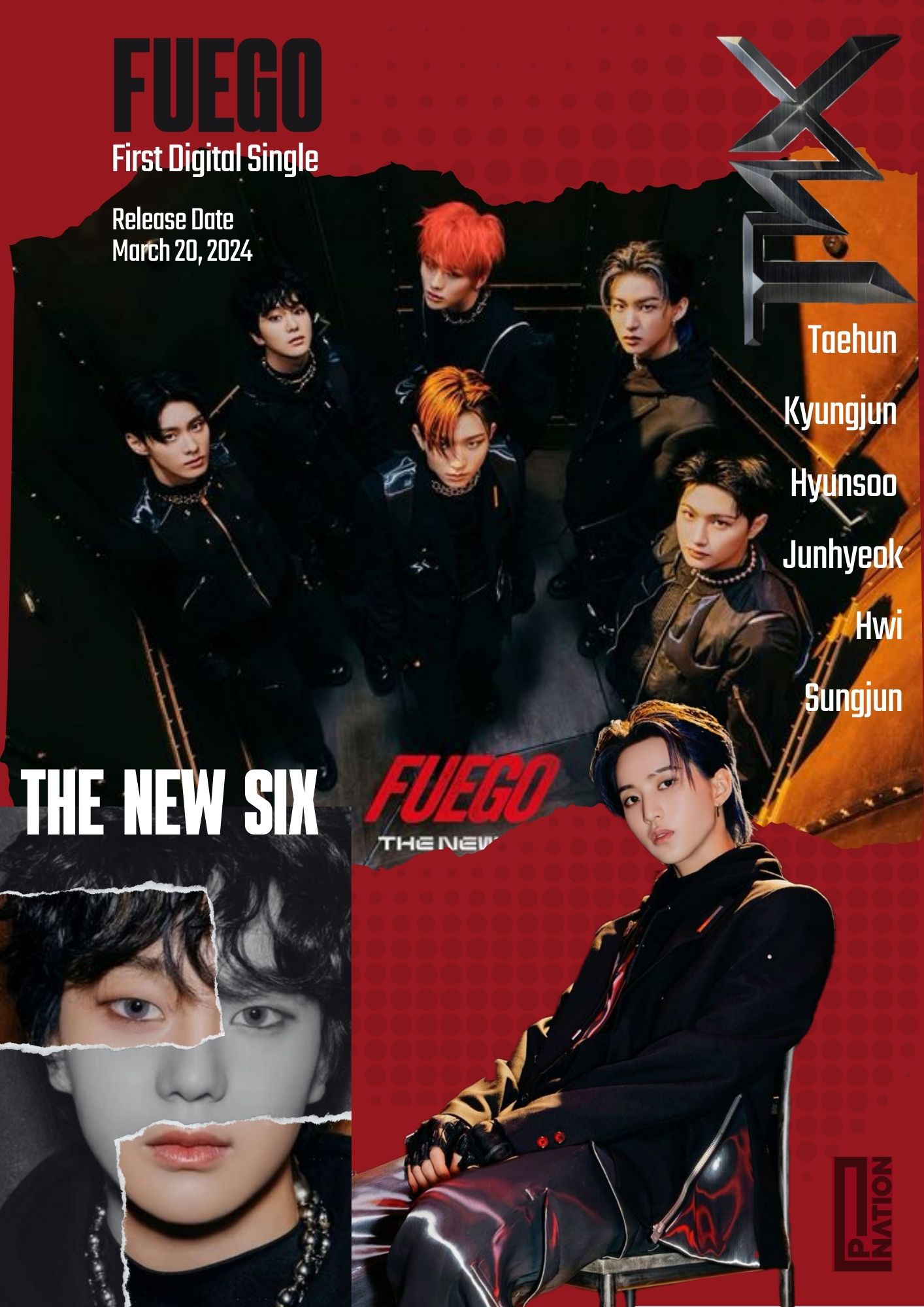
FUEGO was TNX'S 1st Digital Single, that came out mid 2024, the concept photos were dark and looked rebellious. That's exactly the vibe I wanted to create with the Poster, using the official photos and making them looked ripped. Since Fuego means fire, I thought a red background would match.
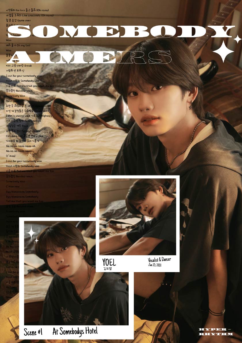
This (Lyrics) Poster was Inspired by AIMERS Single "Somebody". I used official Promotion Photos from the Member Yoel, because I liked the lighting and warm earth tones of the Photos.
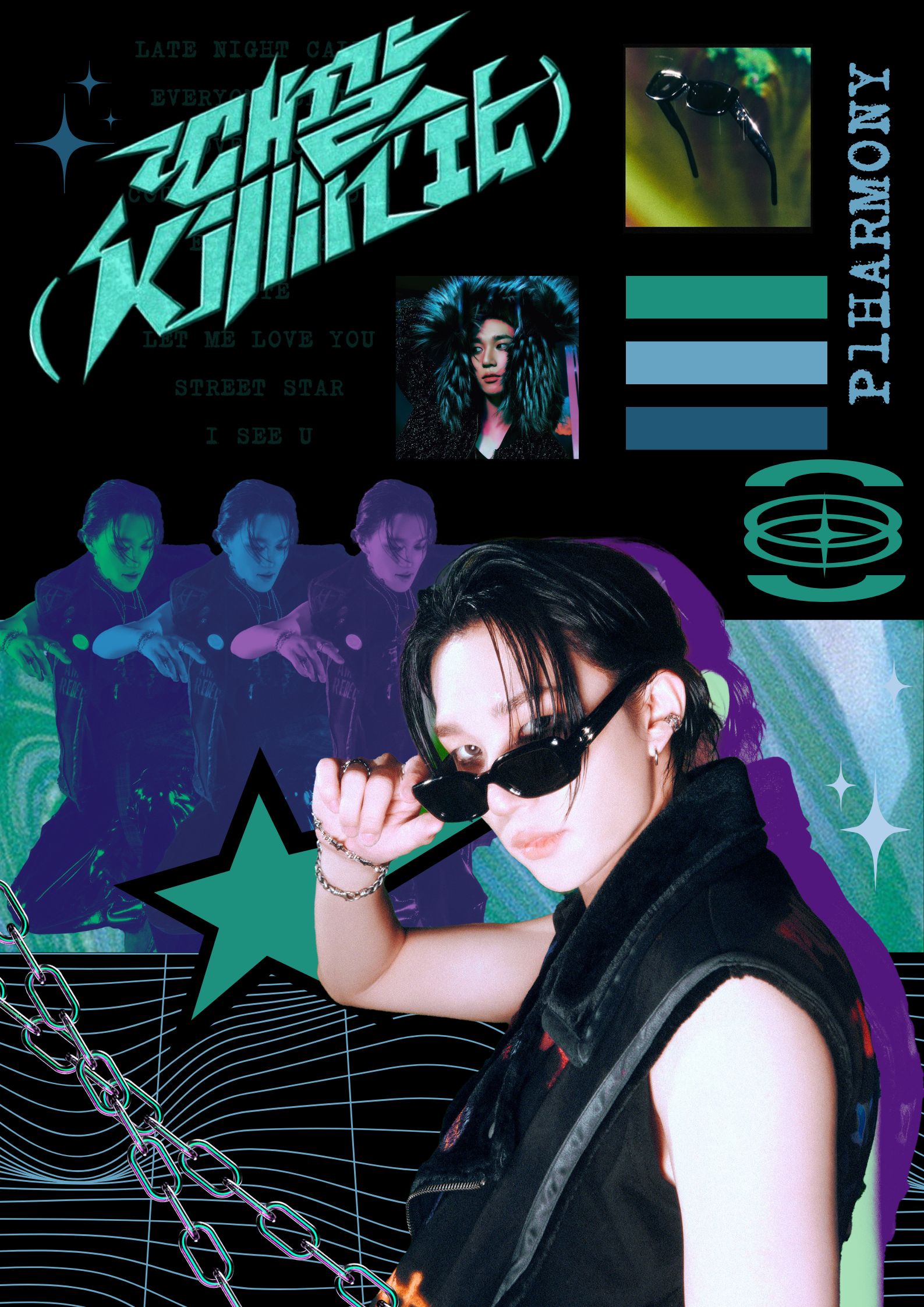
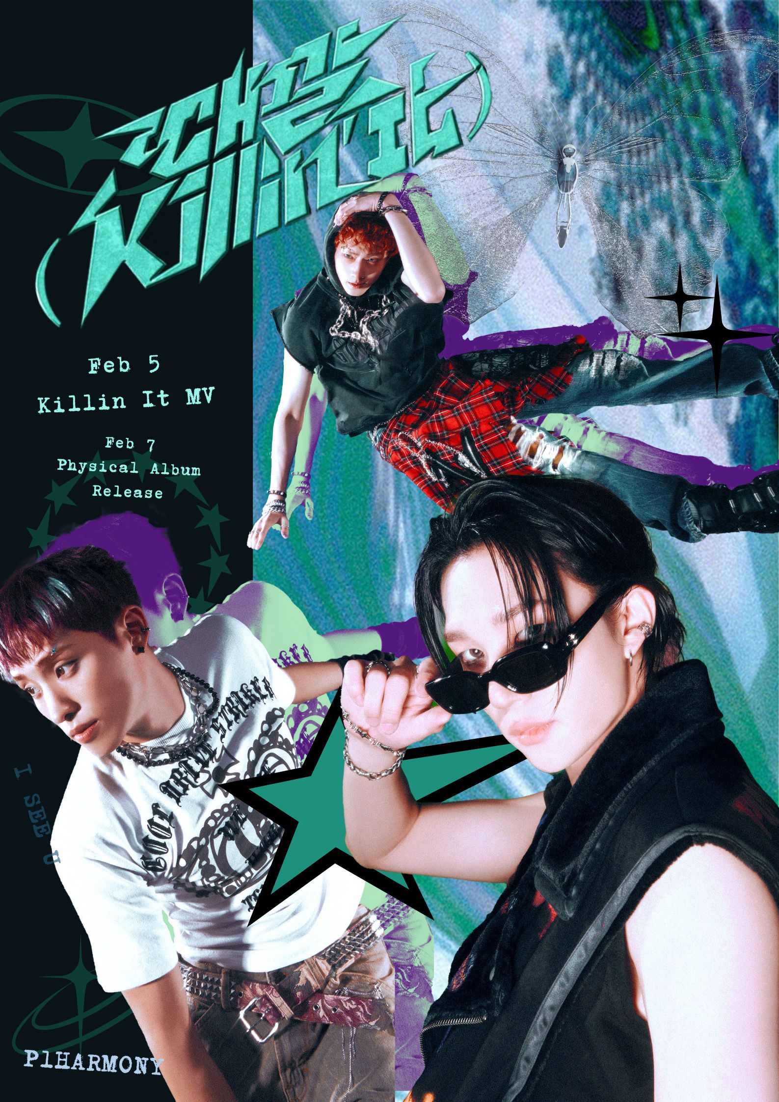
I tried making some Comeback Posters for P1HARMONY'S Killin' It, using offical promotion photos and staying in the color scheme of the album. Version 1 and 2.
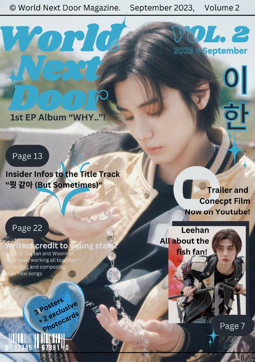
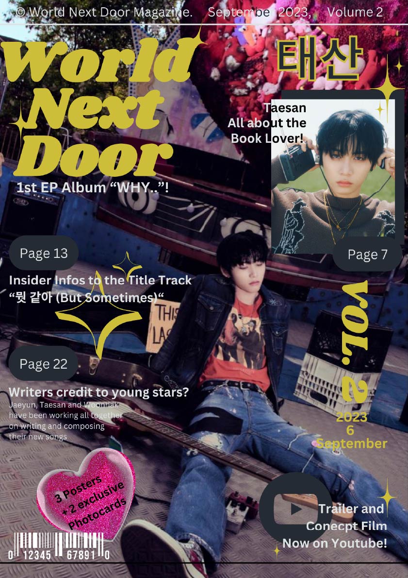
My second attempt at a Magazine Cover, for the Group "BoyNextDoor". Version 1 and 2.
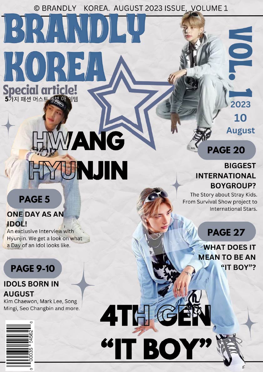
This was my first try at Designing a Magazine Cover. I came up with the Magazine Title and articles myself.