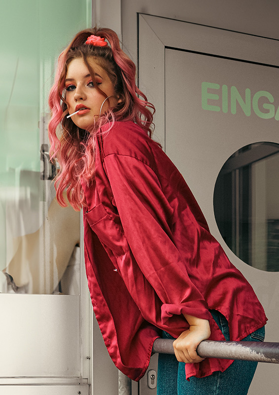
As a part of an 80s-themed photo series during an internship, me and some others who took part in this internship took pictures of one another in an 80s-themed diner.

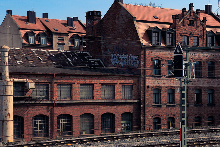
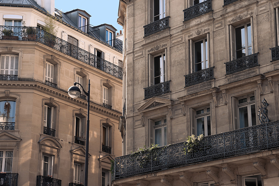
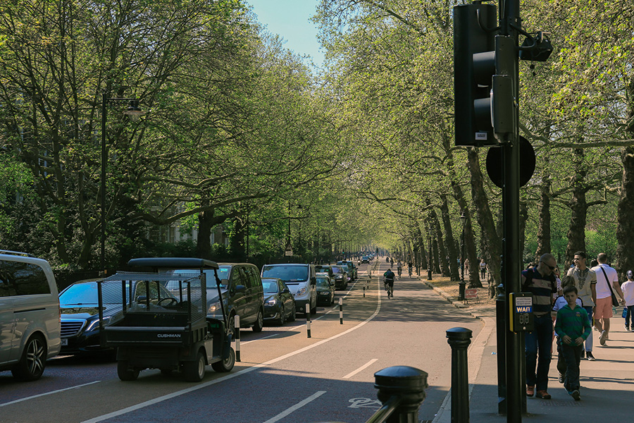
I took each photo in this series while exploring different cities in Europe. The first one was captured in Nuremberg, followed by Paris for the second, and finally London. I thought it would be interesting to group them together because I found the contrast between them quite appealing.
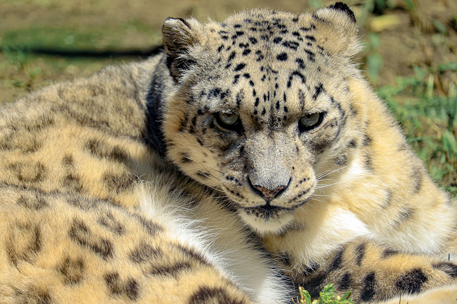
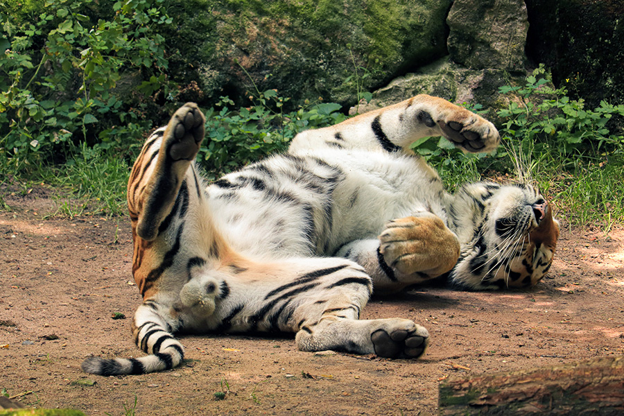
I took these two pictures during a zoo visit in Nuremberg as part of my internship. What made these two photos really stand out to me was the striking difference in their atmosphere, despite the fact that these animals typically share many similarities. The Tiger has a surprisingly docile presence, in stark contrast to the leopard's threatening presence.
For this project, I used an AI to generate images in different art styles. After making minor adjustments to these images, I designed posters in DIN A3 format, using them as the focal point.
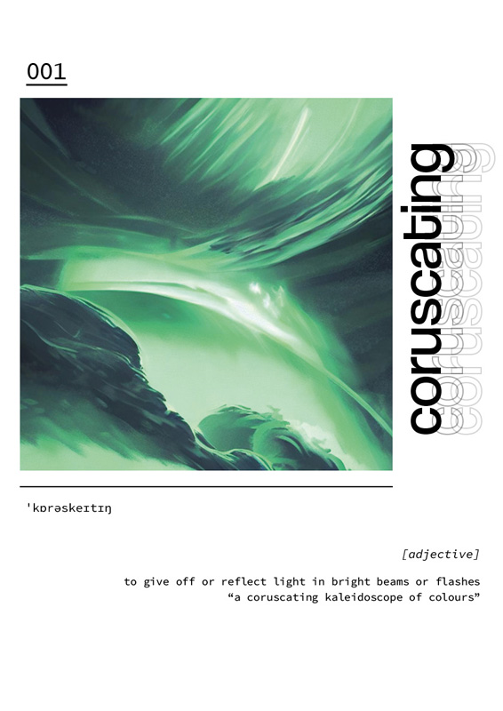
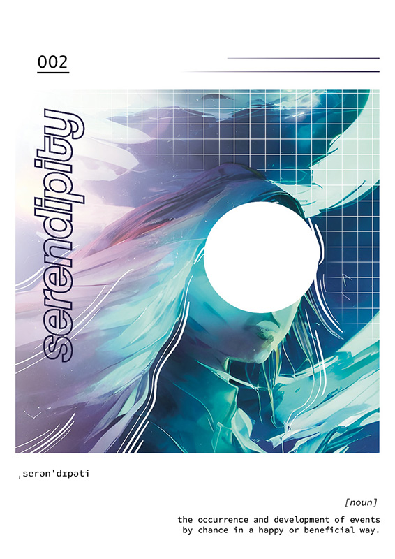
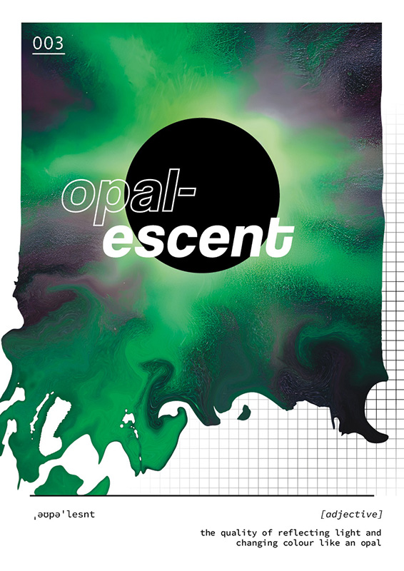
These are the poster designs for the design topics exhibition taking place at my university. They originated from an assignment during my second semester in Typography. I ultimately decided to use the first design to promote the exhibition.
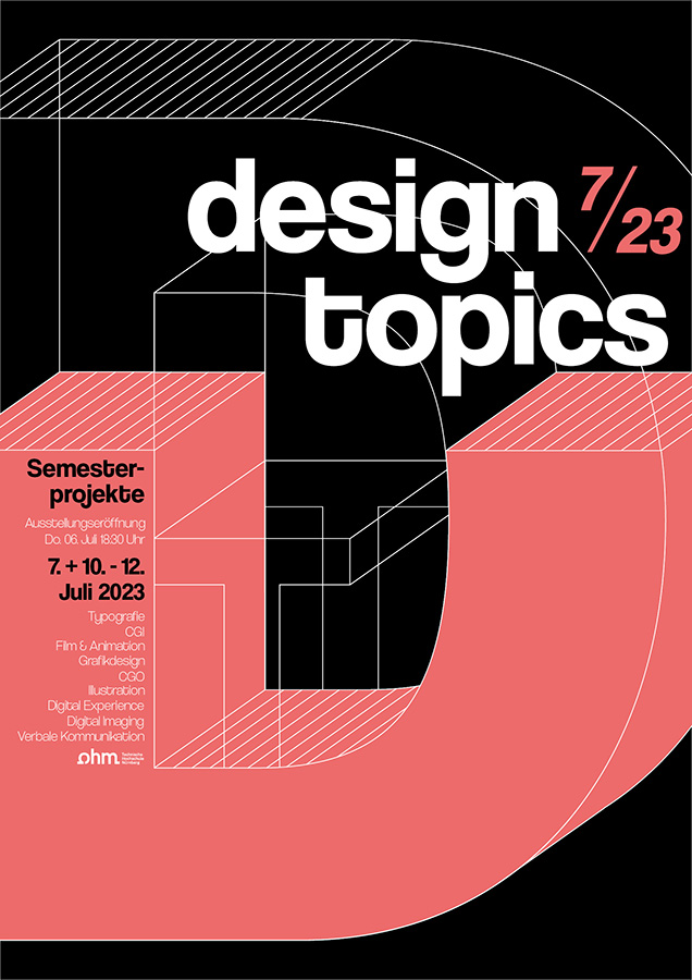

To contribute to the design topics exhibition, I crafted an animation as an exhibit. At the start of my second semester in Typography, we were tasked with choosing a font to study for the entire term. The final assignment for this semester revolved around creating an exhibit that highlighted any aspects of our chosen font. I opted for "Coolvetica", a modified version of the well-known Helvetica font. Through this animation, I aimed to illustrate the connection between these two similar fonts while bringing out the distinct character of my chosen font.

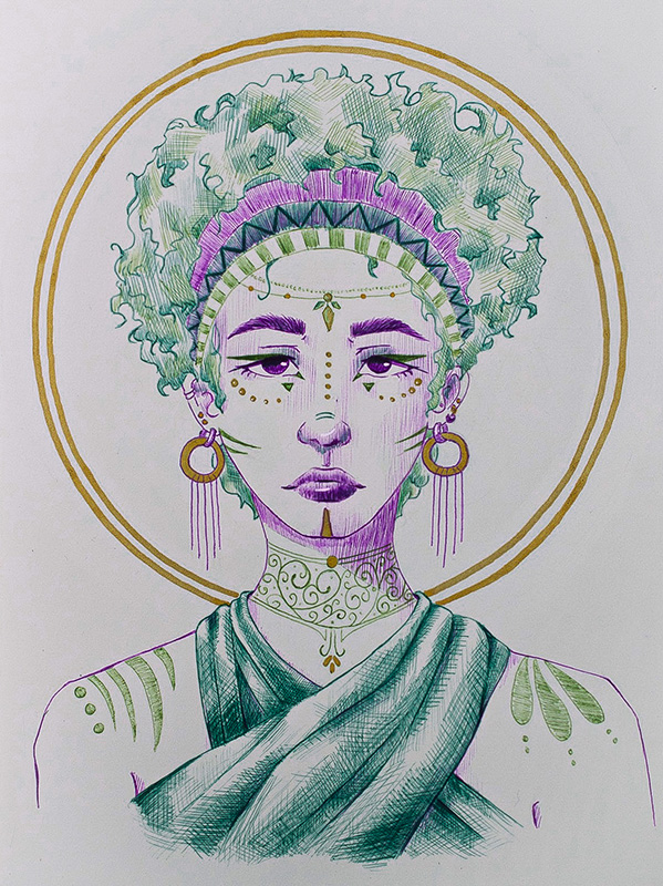
A small illustration I did with coloured gelpens. I tried some different hatching techniques and added some small details with gold to make the drawing pop more.
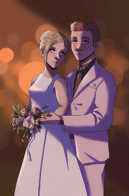
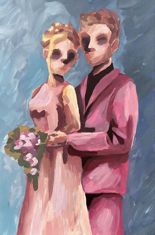
I made these two illustrations for a school project during my last year. I decided to take my parents' wedding picture and recreate it using different art styles and techniques. The one on the left was done digitally, while the right one was painted with acrylics on A3 paper, with thick layers to add texture.
