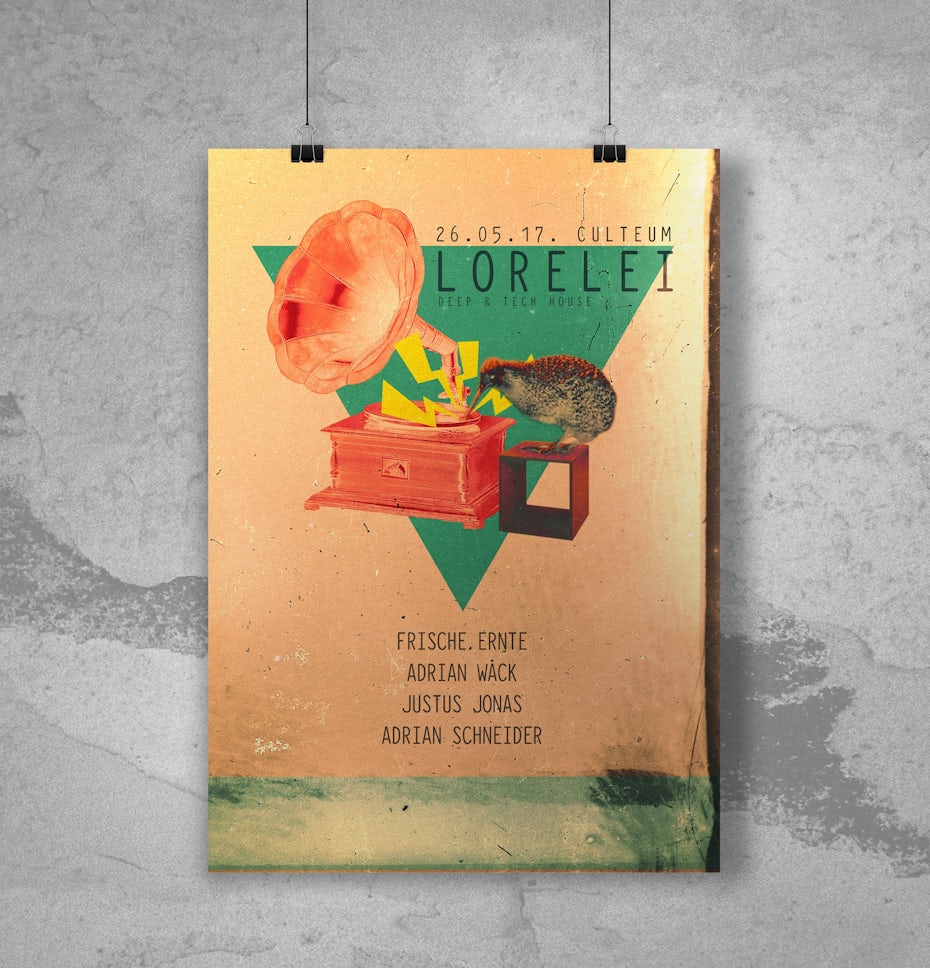
The life of a designer is a life of fight. Fight against the ugliness. Just like a doctor fights against disease. For us, the visual disease is what we have around, and what we try to do is cure it somehow with design.

Now that it’s time to start designing, don’t forget your brand design standards. While you might be tempted to try something new and out there for your poster, your design should still be in line with your overall branding.
Choose design elements (like colors and font) that feel in line with your brand personality and what you’re advertising in your poster.
Just starting out and haven’t figured out your brand design standards? Make sure to give our post on how to create a brand style guide a read to help you iron out the details.
You probably have a really firm idea of what you’d like your poster design to look like. But at the end of the day, it’s not what you want that’s important—it’s what your audience wants. And if you want your poster to drive serious results, you need to keep your audience front of mind when you’re making design decisions.
It’s important that the way you lay out your poster design makes sense for your audience. As you’re designing your poster, ask “what would my customers want?” Would they be more into an image-heavy design or do they need more information laid out in text? Are they into big and flashy or more subtle and subdued? Are there specific colors or effects that will get them excited? Where can you put your most important info (like event details) so they’re sure to see it.
It’s also important to consider where your audience will be seeing the poster. Are you going to put this poster on the side of a bus? Then you’ll want your font to be big and bold so they can catch important information even as a bus whizzes by. Is the poster going to be pinned to bulletin boards in coffee shops? Then you want to make sure to use bright colors and design elements so it stands out from all the other posters cluttering the space.
The more your poster design makes sense
When it comes to poster design (and design in general), there’s nothing more important than style. But how do you make sure the right style comes across in your poster design?
KISS (Keep it simple, silly!)
There’s nothing worse than an all-over-the-place poster design. If your poster looks like every design element under the sun threw up all over it (Text! Images! 3D effects! Glitter! Shine! ALL THE THINGS!), you’re audience is going to be overwhelmed—and your message is going to get lost in the shuffle.
If you want your poster design to be impactful, keep it simple, silly! Clean, simple, and easy-to-process poster designs are always better than posters that look like they’re trying to compete in a “how much can I fit on one piece of paper?” contest.
People dig originality. And if you want your poster to make an impact, you need to be original.
People don’t want to see more of the same old thing. If you want to grab their attention, you need to dare to be different! Try something new. Think outside of the box.
The more original your poster design, the more it will stand out to your target audience.
